
UX4G 2.0: India’s Design System for a Billion Citizens

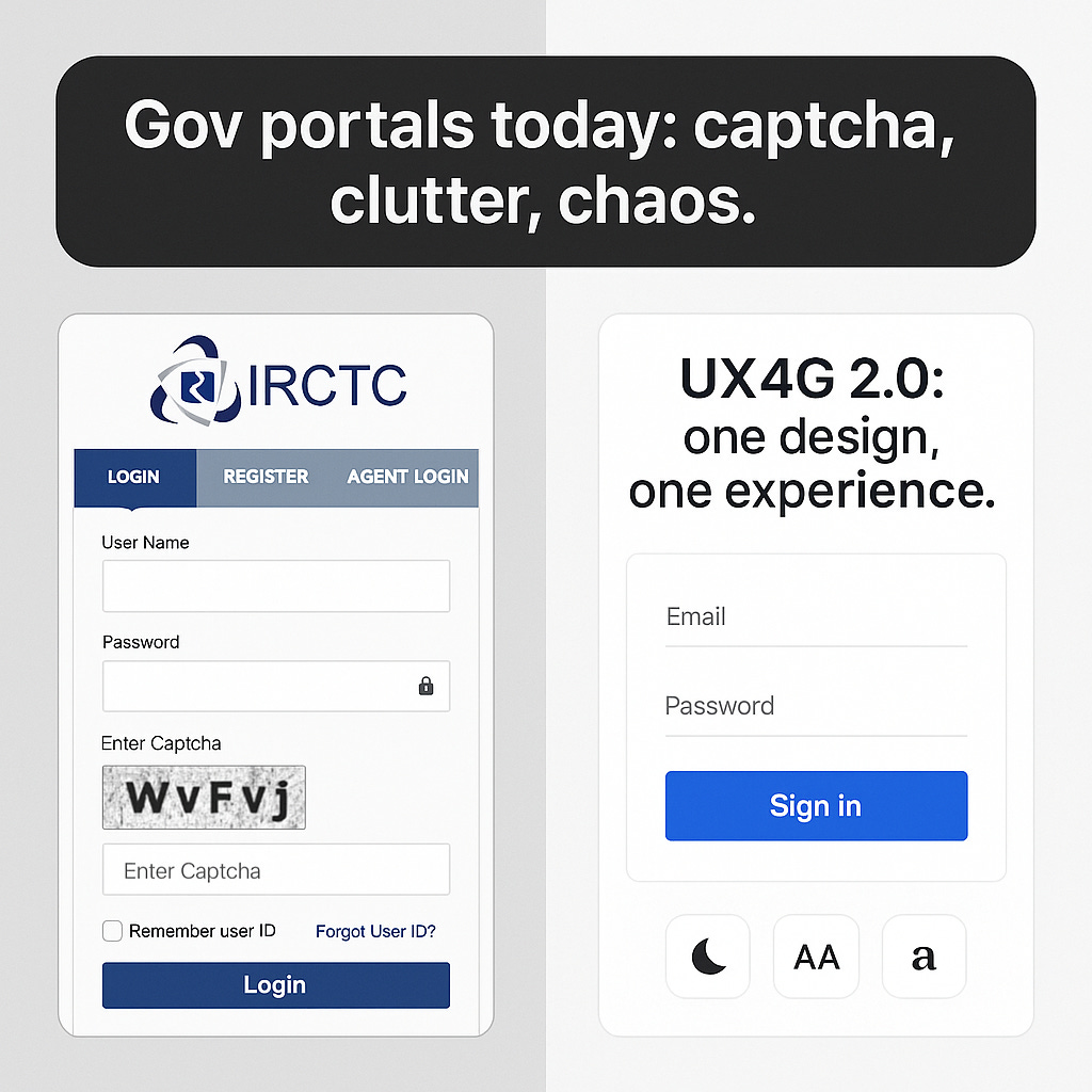
I recently helped my aunt navigate IRCTC to book a train ticket-and half her time was spent wrestling with captchas, multiple login steps, and tiny buttons she couldn’t read. It struck me: what if every government portal just… worked the way Paytm or Swiggy does?
That’s the everyday frustration UX4G 2.0 aims to resolve-by giving India’s e-governance a unified, accessible design system.
What is UX4G 2.0?
UX4G stands for User Experience for Government Applications, a Digital India initiative under MeitY/NeGD. Its goal is simple yet ambitious: make every citizen-facing service-from EPFO to Passport Seva-feel consistent, accessible, and frustration-free.
The first version was launched in 2021. Now, with v2.0, UX4G has matured into a full-fledged open-source design system-complete with design kits, developer assets, accessibility widgets, and audit tools.
Official site: ux4g.gov.in
What’s Inside UX4G 2.0?
1. Design Assets
Figma Design Kit available on Figma Community, packed with tokens, typography, buttons, navigation, and accessibility-ready components.
Handbooks and Guides to ensure not just visual consistency, but interaction and flow patterns across services.
2. Developer Integration
Ready-to-use CSS/JS via CDN so teams can instantly apply UX4G styles.
GitHub Repository (v1) with grids, utilities, bundles, and templates- v2.0 expands this into more modular atomic components. GitHub repo
3. Accessibility Tools
Plug-and-play Accessibility Widget with dark mode, text resizing, high contrast, and dyslexia-friendly fonts.
UX Health Self-Check and Audit 360, tools to evaluate interfaces against 99+ usability and accessibility benchmarks.
4. Training & Adoption
UX4G has already conducted 78 workshops across states, training nearly 6,000 officials in design thinking and accessible UX.
Case studies are live in apps like UMANG, DigiLocker, DIKSHA, API Setu, Poshan Tracker- showing the system in action.
Why It Matters
Consistency: Imagine switching from IRCTC to EPFO without re-learning how to use the interface.
Accessibility: For the first time, dark mode and dyslexia fonts are standard- not add-ons.
Faster rollouts: Open-source components save months of design and dev time.
Trust: A smoother experience builds faith in digital governance.
The Caveats
Adoption gaps: Not every department will embrace v2.0 at the same pace.
Skill gaps: Some teams lack UX maturity to apply design systems well.
One size vs. diversity: India’s 1.4B users span languages, literacy levels, and devices- local adaptations will still matter.
Sustainability: Design systems need constant iteration. UX4G’s long-term success depends on upkeep and community input.
A Bigger Reflection
Good design isn’t just about looking pretty. In governance, it’s about trust. When a pensioner can resize text, when a student can navigate content without confusion, when a migrant worker can file a claim without fear of “breaking” the system- that’s when design becomes democracy in action.
UX4G 2.0 is quietly rewriting how citizens experience the state: not as a maze of forms, but as an interface that respects their time, needs, and dignity.
Resources
Official Portal: ux4g.gov.in
Figma Design Kit: Figma Community link via UX4G
GitHub Repository (v1): ux4g-design-system-v1
What if every government service- from health to licenses to education- felt as easy to use as your favorite app? Could UX4G 2.0 be India’s path there?